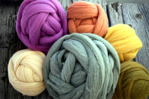
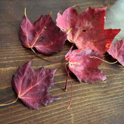
A fleece (not to be confused with synthetic fleece fabric) is the coat of a fiber-bearing animal, typically a sheep or alpaca. There’s a few different ways to get it off of them, the most common being shearing. This is nothing but a haircut, and in fact there were sheep being shorn at the fair – a process that only takes a couple minutes. A shearer takes an industrially-sized clipper and gives them a haircut, after which they frolic, get pet, and generally appear to have a good time reveling in their new ‘do. The fiber comes off in one large piece, which can weigh five or ten pounds, maybe more. The shearer removes the dirtiest parts (called skirting the fleece) and rolls it up in a neat bundle. That bundle is bagged and weighed, as well as marked according to the type of animal and breed, as well as anything else the shepherd wants potential buyers to know. Many of them are marked with the animal’s name, which is cool to see. My wool and alpaca weren’t named, but my bag of angora was courtesy of a rabbit named Azure.
There are many breeds of sheep, and each one produces slightly different wool. I’ve always been interested in the primitive breeds. They have far more variation and genetic diversity than modern breeds, rather like heirloom tomatoes or historic apple varieties. They’re not optimized for industrial carding machines, but they are often uniquely suited to the places where they originate. The Shetland is a great example of a primitive breed, and I was very excited to find a Shetland fleece to bring home and spin.
The Shetland sheep is a very small sheep, and the fleeces are small too – mine was just over two pounds. Their lineage likely starts with the wild sheep of the islands, which were settled over 4500 years ago during the Neolithic. Later, those sheep were bred with others brought to the Shetland Islands a thousand years ago by Norse sailors. This makes them broadly similar to other Northern European short-tailed sheep, like Soays and Finnsheep. Later on some long-wooled sheep were added to the mix (brought to the British Isles by the Romans) and then probably a few other breeds from Scotland as well. This mix has contributed to a remarkable amount of diversity within the breed, although many accounts lament the declining of the wool quality produced by adding cheviot or other stock in the last few centuries. Shetlands are rugged little things, agile and smart (for sheep) and only require about a third to a half the food of larger, more modern sheep, perfect for surviving the harsh conditions of their island habitat. Although marked as an Endangered Breed in 1977, the hard work of the Shetland Flock Book Society and others has brought the breed back to more comfortable numbers. By 1985 they were reclassified to category 5 (Above Numerical Guidelines) and reclassified again as a Minority Breed in 1990.
Shetlands come in 11 basic colors with dozens of different traditional markings. Notably, they’re one of the few breeds that can produce a true black, which was especially important before the advent of synthetic dyes. Black is a tough color to dye, even now. They produce some of the finest wool of any sheep, too, and it’s very lustrous. Many Shetlands are long or double-coated, with long, wavy outer coats protecting the shorter, downy undercoats. All of these things are anathema to commercial processing plants, which prefer single-coated, white, uniform fleeces, preferably from larger and more productive sheep.
Straight off the sheep
As much as it resists commercialization, the variety within the breed (and within a single fleece) can be a boon to a hand spinner. The extra fine wool of the neck can make incredibly soft, delicate shawls and baby goods, the lustrous guard hairs make hard-wearing and durable yarns, and their various colors and often mottled coloring means you can get several colors as well as several different wool yarns from a single fleece. A small flock could easily provide wool for all sorts of items and uses.
The Shetland Islands are known for a couple different kinds of knitted goods made from these sheep. One is wedding-ring shawls, which are a marvel straight out of a fairy tale. These shawls, square in shape and often as tall as the spinner, are spun fine enough to pass through a wedding ring. They require careful processing of very fine wool and a skillful spinner. One account, from 1856, mentions that some truly exceptional spinners could produce six thousand yards of three-ply thread from two ounces of raw wool. (Sketches and tales of the Shetland Islands, by Eliza Edmonston)
The Shetland wedding ring shawls were made from Shetland wool, of course, but a tradition of wedding ring shawls developed independently in Orenburg, Russia too, from a goat fiber similar to cashmere. I’d love to attempt a wedding ring shawl, though I don’t know if my spinning is fine enough yet. Queen Victoria commissioned several Shetland shawls to give as gifts. She was a great patron of the needle arts; Honiton lace gained international fame after she commissioned two hundred lacemakers to make the flounces for her wedding dress.
The North Atlantic is a cold, blustery place, and it’s not surprising that a tradition of warm woolen sweaters developed there as well. Specifically, the Shetland Islands produced sweaters knit in a distinctive stranded colorwork called Fair Isle. Long ago these were made with naturally-dyed yarns, but as demand outstripped the local supply of the often slow-growing dye materials, the knitters switched to using the natural colors of the wool itself in order to protect the lichens and alpine plants of their home. Not only does the method of knitting produce colorful patterns on the surface of the fabric, but carrying strands of two or three colors on every row makes them thicker and warmer, too. I’ve been working on a sweater of this sort dyed with local materials for some time now, though my progress has been slow.
This fleece is about two pounds unwashed, so I’m hoping to have enough when it’s all processed to make myself a lightweight sweater like the ones Tenzing Norgay and Edmund Hillary wore as they reached the summit of Mt. Everest. I could use a sweater fit for the Himalayas, and I’ll probably nearly live in it during the winter months.
]]>I’m glad we were so careful with applying tape; the enamel itself is pretty tough, but the clear coat seemed more brittle. Next time I’ll block the tiny screw holes better, though. We left the smallest holes open to get smooth edges, but the screws are milled to such fine tolerances that the slight thickening from the paint was noticeable. I had to carefully slice around the edges of the screw holes so that the screw shifting the enamel on the inner edges didn’t fracture it too badly.
The badge and plates polished up beautifully. I had no idea that the badges started off this light; I’ve only ever seen them tarnished to a much more coppery color. The old trademark has much more style than the newer ones, I think. I might be biased because our mark is crossed sewing tools with a spool of thread too, but this sort of design was very popular in the late 1800s, and I think it’s a good one.
The boat shuttle reminds me I have to take a look at Rania – she’s old enough to have a shuttle, not a bobbin, which is new to me. One day I’ll clean her up like this but I won’t repaint her. Fortunately her decals are in much better condition than poor Clara’s were. I have two more sets of decals for 66’s, and I’m pretty settled on doing over Bea and Elizabeth with them. Those are the two machines that I sew on all the time, and although both work beautifully, they have quite a bit of wear. I originally thought to do Dorothy and Elizabeth, but under all the dust and grime Dorothy actually has less wear on her paint than Bea does. She’s missing some parts and is rusted (and gunked up) stiff, though.
Clara was pretty stiff when I got her too, although her wheel did turn a bit. She and Bea came as a package deal, and as Bea was in better shape I brought her to working order and set Clara aside at first. In putting her back together, I remembered why she had been set aside – a few of her smallest bits were broken or missing, like her take-up tension spring. I hunted around for an hour or so before realizing that it wasn’t missing but still just where it belonged (the identifying bit broken off, and the rest hiding in the tension assembly).
That wasn’t the only thing gone; she’s missing some felt and a screw, too. This piece of felt goes around the bobbin race and keeps it oiled, and it’s very common to find it wholly (or partially) removed, usually by someone pulling at it. It’s fitted into a spring screw, and Clara’s, like many others, looks like it was pried out by someone trying to clean it and mistaking the red felt for lint. The remains of the felt are still in the spring screw, compacted and coated in years of oil and nearly impossible to winkle out. Forty minutes of trying to winkle it out with pins, pliers, and a razor blade only netted me these teeny scraps. I eventually resorted to burning it out with a lighter. I ordered parts for her and a new plate for Dorothy; when I get them I can cut a new felt shape and load this part back up before assembling the lower mechanisms.
I was stymied on the tension assembly (the first part I tried to reassemble) and figured I’d do the bobbin and feed dogs when I got in my new parts, so I took the leap and put together the bobbin winder first. It’s a finicky mechanism because three tiny springs are held under tension, but the clockwork is neat, and when they work well they are very cool to see. There’s a cam underneath the large gear, and the screw to the right of it holds a little arm that follows the cam and makes the thread guide rock back and forth like a very slow metronome.
The bobbin winder, assembled and mounted. The most difficult spring was the one that sits under the mount to the flywheel cover – the others weren’t too bad. That one holds it down when it is engaged, and the third pops it back up when the bobbin is full.
I’ve got a video of Bea’s in action, but I’ll have to take a video of Clara’s all brightened up for you guys too. I was planning on taking a couple videos once she’s rebuilt and her timing set, anyway. I’m spoiled; the old machines are so much quieter and smoother than modern ones. Without a motor Clara will be the quietest of the bunch. I haven’t put a machine in the treadle table yet, but working the treadle on its own is far quieter than a motor.
The treadle itself was a little strange to learn but fun to use, once I got the hang of it. I’m used to treadling with just my right foot because of my spinning wheels (which are both the bulky traditional ones, not the modern fold-up ones with double pedals). The Singer treadle tables are meant to be used with both feet; the right up at the top corner and the left down at the bottom corner. Alternating presses mean that no movement is wasted, and the load is more balanced between your feet. You could sew for hours without getting tired. I hope so, anyway – I’m sure I’ll find out soon!
]]>After plenty of careful taping, Dad and I primed her for a few coats of black enamel. The hours of sanding paid off as she took the satiny primer and then gleamed under the glossy black. Even covered with tape and missing most of her parts, the transformation was astounding. The shape of the Singer 66 is iconic, but one of the things I’ve always liked best about them was their beautiful gold designs. I’ve mentioned my love of Art Noveau before, and I ordered decals for her in one of the most ornate and colorful designs that was ever made for the 66 at the height of the Belle Epoque– the lotus, or thistle, pattern.
Painting was fun, but the decals were the part I was most nervous about. Cutting them from the sheet was nearly as bad as cutting threads for whitework embroidery, but after several hours they were all trimmed and laid out on the counter in an approximation of their placement. I’ve never actually gotten to see a 66 in this design, so I made sure to research the details of her design very carefully. Complicating the matter was the fact that no matter how closely I marked out pieces, I seemed to have a decal left over. After a couple frantic hours of peering at vintage machines, I came to the conclusion that we had extra decal.
The red eye pattern for the 66 has a small straight design on the flywheel cover, and a smaller, simper one above the tension screw. The lotus has a straight design on the flywheel cover too, but nothing above the tension screw – because the big decal on the arm of the machine has more visual weight at the ends, and probably would have looked too crowded. So in essence I had two decals that could be used for the flywheel cover; one larger and one smaller. This ended up being very lucky for me.
The first decal we applied was the smaller version of the flywheel one, just in case. It went on smoothly and shone against the black enamel. All my reading had me convinced that these decals would be as fragile as snowflakes and that correct positioning would be practically open-heart surgery, but they weren’t nearly as terrible as they had seemed. I couldn’t believe that I had never heard of decals before – they were great! I started eyeing other things around the house that could use a bit of fancying up. My phone, the computer, maybe the stand mixer . . . there were so many potential targets for a decal.
We let the flywheel cover dry, brought it downstairs for a clear coat, and disaster struck. Even a light clear coat beaded up on the plastic and rolled off in drips, wrinkling the edges. Nothing we tried could save it. The flywheel decal was a mess, and with a couple clear coats on it we couldn’t just peel it off and start again, either. I vaguely remembered a grownup putting decals on a vehicle as a kid, and I think a mishap screwed one up and seriously strained a friendship, too. Maybe this is why you rarely hear about them. Fortunately, my extra decal meant that I wouldn’t have to buy a whole new sheet. Sanding down the paint, testing scraps of decal paper, and making sure the clear coat would work was an unexpected hiccup (and the reason for the slow update). Dad discovered that only the tiniest dusting of clear coat could stick to the decals, so after a successful test of building up layers it was time to put the rest of the designs on Clara.
Dad showed me how to apply a decal with the flywheel cover, but putting on the rest of them would be up to me. With much double-checking against pictures of historical examples, I took it from the top. It was slow work – although there were only a few parts that were truly finicky, like the branched design under the vases. I cut the decal paper very close to them, and a couple times had a little branch fold over against itself and need to be very carefully detangled.
Except for the border and medallion on the bed of the machine, all the decals were applied to surfaces that were more or less curved. I had trimmed them close to start with, but in a few places a little extra trimming was necessary to accommodate the ease – especially for the large blossom over the stitch length screw and the one on the curve of the flywheel cover. After the careful easing and tiny branches lining up the edges of the six border pieces on the bed was simple in comparison. The scarab medallion in the middle was the perfect thing to finish on; it didn’t have too many projecting bits and sat nice and flat.
Overall there ended up being seventeen separate pieces to apply (I had to cut the spool medallion one in half to fit it around the post). In an afternoon Clara transformed from a black shape into a confection of the Gilded Age. Even missing her hardware and covered in tape, she is stunning. I’m itching to put her back together, but she’ll need several very thin top coats first, especially on the bed since it sees the most wear. As pretty as she is she’s not just for decoration – she’ll be set up in a treadle table and used beside Elizabeth in the studio.
This little treasure is hidden somewhere on the grounds of the Levi Heywood Memorial Library in Gardner, MA. I had planned to hide it in the library itself, but their summer hours foiled my plans. That makes it a bit easier for you; you’ll have more time to look.
Time plays a part in our final two hints, both taken from Shakespeare’s As You Like It. The first one is said by the lovestruck Orlando:
“You should ask me what time o' day: there's no clock
in the forest.”
No clock in the forest, but you can see the Library’s clock from a certain little grove of trees. They are lovely shady trees to sit a while and read under.
Our second clue is provided by Celia:
“Finding him, and relish it with good observance.
I found him under a tree, like a dropped acorn.”
Good luck and happy hunting! If you’re not the last, re-hide the pouch well, and take a selfie with your new shroom! You can tag us on Instagram @broiderie.stitch or on facebook by searching Broiderie Stitch.
Looking for other artist's mushrooms? Look here for the master list.
]]>A couple of these machines came in lovely condition, although most of them certainly did not – decades of grime, missing parts, and even faulty wiring are par for the course for cheap or free machines. But they were built well; even if their mechanisms are frozen up with old grease and disuse they often need nothing more than a good cleaning and a little adjustment to come back to life. I planned on doing a bit more than the usual cleaning with this one, mostly to see what a difference a timing adjustment and reduced friction from clean hardware would do for her stitching.
If we’re going so far already, why not give her a pretty new design to match? Cleaning her up as thoroughly as I planned would likely ruin any potential antique value, so there was no reason not to go all the way, really. There was little resale value to begin with; these machines were made by the millions and built to last, so they aren’t as rare as one might think. This one cost me $20. Ones in good condition certainly sell for more, but since I get them for use and don’t mind cleaning up and tuning them, I don’t mind getting beaten-up machines. These old girls are made to work, and with some patience and a good cleaning, they usually still do.
Clara, poor dear, was one of the worst off. She came as a package deal with Bea, and I only narrowly escaped a third that day (fortunately there wasn’t enough room in the car for the cabinet). She was frozen stiff and quite a mess. A few hours and a box of q-tips later, we had her functional though still a sorry sight compared to her sisters. Her 98th birthday is coming up in a couple months - a perfect deadline for giving her a makeover. No more rust, no more age-old masking tape, no more worn and scratched details – she will be completely refinished, and with a lovely new design to boot.
Clara, Bea, and Dot all have the ‘Red Eye’ decal design – the most common found on old American-made 66’s. People refinish vintage Singers with all sorts of bright and colorful modern designs, but I prefer the originals, particularly the ‘Lotus’ pattern. It’s not as common as the Red Eye in American 66’s (however it’s much more common than the Red Eye in British made machines, so go figure), but they are just as gorgeous. I was able to find decal sets for the 66 in the Lotus, Acanthus and the Celtic Knot patterns; Elizabeth and Bea might get makeovers too one day. Dot and Evelyn both have little wear on their designs, so they’ll stay as they are, just shined up a bit.
(Side note: I found out that decals can be put on all sorts of things, and I think my stand mixer may end up dressed as a vintage sewing machine as well. At this point no small appliance is safe. You can get blank decal paper, too, and print your own designs.)
But back to Clara. With several dings, some deep chips, and a few patches of rust, she needed to be taken down to the paint in order to be smoothed out and re-finished. I stripped off most of her hardware – not only the faceplates and bobbin race, but the flywheel assembly, tension discs, feed dogs, even the bobbin hook. This means I’ll have to fix her timing, but it wasn’t great to begin with, and she at least has timing notches to make it a little less tedious. I’ve never adjusted timing like this before, but it seems simple (if fiddly) work.
Some of the hardware was simple, but some required a ratchet, penetrating oil, heat gun, and a pair of pliers, in a couple places. Ninety-eight years of lint and grime had compacted in every nook and cranny. One thing I couldn’t remove was the Singer badge, so I’ll need to carefully mask it off when we paint it. I put the pieces in baggies, section by section, to keep everything tidy and make it easier to put back together later. There are many different screws, and some of them are fairly close in size. All the bare metal will need to be majorly cleaned up and degreased to remove old oil and dirt before it goes back together.
With much of the hardware gone, it was much easier to strip the old clear coat and decals off and sand down the paint. I think the clear coat was varnish or lacquer or something similar; it was brown and sticky where I tested it with rubbing alcohol. I used plenty of alcohol and elbow grease to get it off to avoid breathing in particulates as much as possible. It certainly cut down on the amount of sanding necessary, though it couldn’t eliminate the need for it entirely.
When it came to the painting and decals, I decided to call in an expert. My dad grew up working on cars; he started as a teenager and still does, though now it’s for fun instead of a paycheck. Compared to the big wood-finish decals on ‘70s era station wagons, the decals on a little sewing machine would be a piece of cake. He inspected my sanding job, gave pointers on paint finishes, and promised a day where we could do the enamel and decals. That should be fun – but until then I’ll work on cleaning all the little bits until the weather and our schedules cooperate.
Our work is heavily influenced by John Ruskin and William Morris in style but more importantly in principles: craft, art, nature, and social ethics inform all our decisions. People can hardly make art when they are struggling to survive, so we pay a living wage and fight for a better, kinder world with donations, time off to vote, petitions, protests, and an eye to sustainability in everything we do.
Hankies vs. Tissues
The hankie vs. tissue debate may never end, though several things point to hankies (specifically linen hankies) being the most environmentally friendly. Tissues can’t be recycled, and typically cannot be composted well by normal means due to additives. They are often made from virgin lumber, not post-consumer recycled pulp, and are extensively bleached.
Handkerchiefs can be used again and again for years, lessening carbon waste. They take far less energy and far less water than paper tissues, even factoring in washing. Speaking of, think of your hankies like underwear and socks – a fresh one (or more, as needed) every day. Ours can be washed by hand or by machine, so you can toss them right in the hamper when they become soiled.
Sustainability Benefits - Linen vs. Cotton
Linen, made from the flax plant, is one of our oldest cultivated fibers (archaeological evidence shows it used as woven fabric a stunning 36,000 years ago) and is one of the lowest-impact. As a bast fiber, it is far stronger than cotton, and softens over time without linting up. That, combined with its moisture-wicking and antibacterial properties, making it a favored choice for bandages.
Flax takes far less resources to grow. Only 6.4 liters of water are needed to make a linen shirt – compared to 2,700 liters to make a comparable cotton one. It requires less herbicides and pesticides, too. Additionally, more of the plant can be used – flax seed and linseed oil are both harvested from flax. Much of the growing, harvesting, and processing of flax into linen is done by hand, reducing carbon emissions and keeping alive traditional farming methods. European flax sequesters 250,000 tonnes of CO2 a year, too.
If you’re looking for the very most sustainable linen hankies, our oatmeal handkerchiefs are not dyed or bleached – they are the lovely natural color of the flax fiber. You can find them here.
Packaging - Recyclable and Biodegradable
Our boxes, envelopes, business cards, and unbleached kraft paper wrappers are all fully curbside-recyclable. Depending on your local recycling plant, they may or may not take tissue paper; if they do, great! Ours is compostable, so even if they don’t you can always put it in your compost bin as well as the little bow we tie your order up with, which is raffia, a compostable fiber as well.
Trees Planted
Every year, we plant trees through the National Forest Foundation to reforest after wildfires, aid in carbon sequestration, and provide habitat for at-risk species. We have a special box at checkout if you’d like to contribute to this cause. If not, that’s alright – we’ll still plant at least a hundred trees yearly anyway. Our trees have sequestered more carbon than we could ever produce, making us not carbon-neutral but actively carbon-negative, meaning Broiderie Stitch is actually making the world a cooler place. So far (May 2022), we’ve planted 460 trees.
Reducing Studio Waste
Waste not, want not – and we do produce some waste knots and snips of thread stitching up orders. Whenever our snips teacup is full, we wrap up the snips to form the center of a new temari ball. Temari have been wrapped around scraps of cloth, thread, or rice hulls for hundreds of years, so this small but beautiful measure of sustainability has a long cultural background.
We buy our linen by the bolt from Ireland and cut it to have just a narrow strip of selvedge left over from a batch of hankies. It’s too good to throw away, so when we have a basket full, we dye them and quilt them together to make other articles.
We produce very little waste in the studio, and what isn’t reused in other ways like thread, linen, and scrap paper is recyclable. With luck our next studio location will be compost-friendly, and then we will be completely waste-free! Maybe then we will be able to stick some solar panels on the roof too…
Tracing up a suitably mushroomy design
Not everybody cares to hang up an embroidery hoop, so I figured I’d make a little pouch (rather like our RAINBOW BAG TUTORIAL) for the scavenger hunt instead. That way I can fill it with some mushroom-themed goodies, so folks can pick their favorite piece and the last one can have the bag itself. Don’t be a stinkhorn and take them all.
The grass was fun, but the mushrooms have to be the real stars
I adapted this design from a couple antique patterns that I found, and eventually settled on wine caps for the stars of the show. Everyone does amanitas, after all – and wine caps have a dignified beauty all their own. It’s certainly not because I’ve been visiting my wine cap patch every day in the hopes of snagging dinner. In any case, the pale stems, chocolate-purple gills, and big burgundy caps make wine caps well-suited to a more subtle and complex color palette. They come up in late spring and early fall for me, so I decided to have the grasses browning a tad. The leaves are satin stitch, so the shading is very simple, but it worked better than I expected.
Wine caps are called Garden Giants for a reason - they are enormous
A few of the antique examples I looked at had little critters like dragonflies or frogs, so I followed suit with one of the little blue damselflies we have. Their iridescent bodies seem to glow against their dark wings. For a larger piece I might have done one of our local frogs, but the whole design is about three inches square – and it is full enough already. I’ll do proper justice to a frog on a different piece in the future.
A closeup to show the different stitches
Since this little project was just for fun, I was able to use a number of unusual stitches. Satin stitch and stem stitch, of course – but also detached chain, bullion knots, wheatear stitch, French knots, Cretan stitch. It was good to just play around. I am trying to work more loosely when I freehand things, and I was able to practice that with the moss and ground. If I’m not careful, I tend to solidly work things. Having unstructured moss and ground that quickly tapered to nothing meant I had to stay mentally present to make sure I didn’t just keep filling in long past where the design should end.
The bag finished and ready to hold goodies
Overall, I like this little pouch a lot, and I won’t be too sad if no one finds it. It’s a fair bit larger than a deck of cards, so I’ll need to scope out a good hiding spot – I have a general area and a few ideas in mind, but I’ll need to visit them to make sure that this will fit without being too obvious. So here are a couple hints for you: This bag will be hidden in Gardner, MA (and if you’ve been to the studio, it will be within walking distance). Wine caps are often found in human-created habitats, and these ones are no exception. So you won’t need your hiking boots to find them on June 11th. Good luck! I’ll have more hints for you here soon.
]]>The Moon itself being finished was a big milestone for this project, but it is too isolated against the blue silk as it stands. Some fluffy clouds would add interest and contrast – and depth. With clouds in front the moon would recede to the middle distance and the raised edge of the Grecian twist wouldn’t appear quite so stark.
There are many different types of clouds, but for this stylized piece cumulus clouds were the way to go. I was lucky enough to see the moon rising through some perfect clouds at sunset a couple weeks ago, although the light didn’t last long enough to get a picture.
From the beginning I planned on using a related craft, needlefelting, to create the clouds. Needlefelting allows one to sculpt figures out of wool roving by using a special barbed needle. The barbs catch on the loose fibers and draw them down into the mass of wool a few at a time, so it is much easier to control than wet felting. It’s usually done very firmly, but for soft fluffy clouds, I wanted a looser approach. Too loose and they would fall apart and shed terribly, so a careful balance would be necessary.
The clouds would also play a large part in helping to define the style and mood of this piece. I gravitate very heavily to representational art, and with this piece especially I’ve been trying for a far more stylized approach than my usual ‘as accurate as possible’ one. For someone who literally makes things up out of whole cloth, one would think it should come as easily in the figurative sense!
I’ve mentioned the sweeping, defined lines of Kay Nielsen before, and I wanted to carry the same sort of storybook illustration feel through the clouds. Realistic ones wouldn’t be nearly as colorful (or as defined) but such strong colors in the background called for a bit more than whites and greys. I got out my hand carders as well as a few colors of wool and mixed up a palette of shades from a soft, warm pink to a medium-light blue. Although it seemed fairly bright while I was preparing it, against such a saturated background it looked almost steely. With each color I carded I added a generous pinch of a sparkly metallic. Even with a bit of sparkle, the clouds were still a stark contrast to the gleam of the Moon.
In order to bring more harmony to the Moon and the clouds, one of them would have to adopt something from the other – and at this stage, the Rabbit would not be changing. Fortunately, there were plenty of beads left over; not only the pearly white ones that feature so strongly in the silk ribbon areas but several other sizes and colors as well. Both the frosted and clear glass beads had gleams of iridescence that tied things together nicely. I had high hopes for the little silver ones, but they came off too strong nestled in the wool. None of the smaller crystal beads worked either; although I had planned for drifts of tiny beads both light and dark along the edges they looked overworked. If there was to be silver elsewhere in this composition, it couldn’t be in the clouds.
Unlike the silk ribbon areas where tiny beads and chips clustered abundantly, the clouds needed a far lighter approach. Each grouping could only contain a few beads, and because they were much larger, they had to be carefully selected. To anchor the largest clusters I used some lovely rock crystal beads – their matte luster and crackled interior added just the right amount of interest. The pearly white beads and rainbow glass beads grew out from there. Several times I had to dial it back before the clouds were overwhelmed.
When I found the quartz beads, I also picked up a string of tiny silver stars. I was afraid they might be a bit thick to stand isolated on the painted silk (the sudden height of beads being the main reason I rarely use them in embroidery) but with the much taller moon and clouds they fit better than expected. Being silver, they helped to draw the color of the moon out from its severely delineated circle, too. Deciding on where to include them was much harder than deciding to include them, however.
I tried scattering them over the surface from a height – they bounced off the clouds and puddled together awkwardly. I tried to scatter them evenly over the surface - no better. I tried looking up where the stars would be relative to the moon on certain nights and no matter where or when or what the cutoff for including certain stars was, it looked unbalanced. It took several days of muttering, tinkering, and research to find a layout that I was happy with. Once again I was thinking far too literally.
Once again I turned to my books – and found my answer in ‘The Three Princesses in the Blue Mountain’. After several adventures the gallant soldier rescued the three princesses, only to be trapped by his companions in their former prison. It’s a familiar tale with several variations. When a mysterious key leads to a rusty whistle, help arrives on feathery wings – and the illustration accompanying it shows the flock wheeling against a river of stars.
The idea of arranging the stars in an intentional manner (and not just ‘intentionally random’) was one I hadn’t considered. However, it fit beautifully with the structure of the design. I scattered stars and sequins in a rough line and cut even more tiny chips to add depth and feather the edges of the sweeping line. I had to break this part of the chipwork into several stages; the combination of tiny silver chips against the deep blues produced a strange visual effect if I concentrated too hard for too long. Whenever the background appeared to recede and the stars began to float unanchored over it, it was time to take a break.
With a final scattering of crystals, the Moon Rabbit was complete. Though this inconstant Moon has gone through monthly (indeed sometimes nearly daily) changes in her circled orb, I think in many ways she has been improved by them. I hope to use several of the techniques pioneered in this piece in further work – and maybe one day a companion piece in the same style. This has been my biggest project to date in a number of ways, and I’m glad for the chance to develop a bit artistically. Most of my work falls into the ‘craftsman’ category in my mind – a good and necessary thing – but I do wish I could justify more of this sort of work as well. As much as I am honored to have this piece exhibited in the San Francisco School of Needlework, I am very much looking forward to getting it back and hanging it here in the studio.
One purl at a time
I’ve used random chipwork before in our Heraldic Initials but never had a really good place to use patterned chipwork. From the very beginning the edge of the ear seemed destined for it. Patterned chipwork is best worked over padding, and the high, rounded string padding would provide a sturdy base and well-defined edges to make the ear really stand out. Many of my favorite examples of chipwork alternate between different types of metal thread; in this case two pieces of smooth purl and one of bright check purl. Smooth purl is a very tiny wire wrapped like a spring with a hollow core; the slightest pressure can crack or displace the coils, making it very delicate. Bright check is the same sort of thing although the wire is wrapped not in a circle, but in a sort of triangular spiral, and all those twisting facets break up the light. It’s a bit sturdier than smooth purl but still quite delicate.
Patterned chipwork is very slow work. Each purl must be measured in place and cut to fit before it can be threaded onto the needle. Marking them to cut isn’t hard – a little press with the side of a needle will do – but handling them without accidentally marring them is very difficult. Every piece is precious, so off cuts are saved for other areas and pieces are carefully planned around coil breaks and kinks. It took hours of work over several days to completely cover the edges of the ears, complicated by the fact that there was very little room to maneuver the needle between the string padding and metal threads (and kid leather) already in place. Bringing the tip of the needle up in the leather or in one of the purls already worked could mar it, so the placement of the needle at the start of each stitch had to be just right.
This sort of chipwork can be varied in all sorts of ways – using all one type of thread, using repeating patterns of multiple threads, or using one kind of metal thread as an accent in a base of another are all stunning. To keep it from being too repetitive, I decided to do one area of each. My favorite is repeating patterns, which ended up being a surprisingly good fit for the ear. Each section was started with a single diagonal purl in the middle to establish the slant, and worked out to the two ends from that point. I expected the ends would require a little neatening up, but the pattern of the purls lined up far better than I could have hoped through all three sections of the ear. I did end up unpicking a little of the bottom at the very tip; the purls were lining up so well that I was able to smoothly join the lower and upper ear with a single purl and continue the pattern without a break.
The small area of pattern chipwork on the rabbit’s flank is a little small to establish a pattern, so it was worked in smooth purl. The edges of the purl tuck under each other in a way similar to stem stitch in order to follow the shape. Preventing the purls from cracking or warping gets progressively more difficult the further they have to bend around a shape. The almond shaped area of the paw is the third area marked for this sort of chipwork; I had no clear idea of what kind of pattern to work on it but wanted something as a sort of visual bridge between the plain smooth purls of the side and the strict alternation of the ear. A couple lines of bright check in a field of smooth purl highlight the curve and echo the lines of the arm.
After finishing the big chips, all that’s left is the little chips in the bottom of the bag – and those trimmings were a bit of a head start on the hundreds of tiny pieces necessary to fill the remaining felt areas. Random chipwork isn’t as exacting as patterned chipwork, but the pieces are usually much smaller. Tiny pieces of purl are stitched down in a random pattern, either scattered or completely covering an area. It is hard to capture the effect in pictures, but all those random facets glitter and sparkle as they catch the light. It makes a good contrast to the smooth shine of the plate and the structure of the patterned chipwork.
With the entire Rabbit completely covered with embroidery the end of this enormous project seemed much closer. It’s not quite finished yet, though. Way back when the ribbon was couched down I mentioned that I had only put in the largest beads to help give it dimension, and I’ve gathered several different kinds of beads since then to incorporate. Tucked into the folds of the ribbons and clustered around the larger beads, they help to soften the difference in height and break up the blue a bit. Stitching things in a random fashion is difficult for me, as is leaving areas only partially filled (who could have guessed?). These bead clusters are a good way to get more comfortable with that.
The Moon Rabbit itself is finished, and gleaming in the sun. Phew! It’s been a massive undertaking; honestly probably my largest project to date and has given me the chance to try so many new things. But with so much complex work in the face of the moon itself it can’t stand all alone in the middle of the fabric. Hints of clouds are showing up on the horizon. So is the deadline – March 15th. I hope to have the last article up for you before then, but it rather depends on how this next part goes.
One thread that I had not planned on incorporating was rococo – a fine silver ribbon wrapped around a thread core in such a way as to make regular waves. I picked it up mainly for curiosity, but found it made a lovely texture for stylized fur. As it is larger and rougher than the passing thread I kept it mainly to the tops of the legs and the back of the Rabbit. Like passing, rococo is couched down and the ends drawn through to the back of the work before being secured. Drawing such a thick thread through so many layers of felt padding was tricky and needed careful planning to minimize bulk and stress in sensitive areas.
For smoother fur on the underside of the foreleg and near the belly I decided on the same passing as the background – but couched simply with a coordinating silvery grey silk instead of the blues of the or nué ground. The smooth passing provided much-needed areas of visual quiet in such a busy design and highlighted the shaping nicely as well. To keep it from fading too far into the background it would need to be clearly defined by other elements as well as the lack of color and padded height. Having the or nué as smooth and gently curved as a coin was well worth the hours it took to sink the ends. As long as the passing on the rabbit wasn’t parallel to the curve of the ground the contrast in direction would serve as a visual marker.
The strong, swooping lines of art noveau in general (and the work of Kay Nielsen in particular) were a major influences in this piece from the beginning, but as things took shape it felt like the numerous changes had weakened the composition a bit. The triangle of purple silk in the hind leg seemed to interrupt the flow of the large teardrop and swoop of the lower back. Unpicking it in favor of silver threads immediately helped smooth the flow, although what silver threads exactly is still to be decided. I’m not terribly crazy about the ribbon on the face, either – although it feels right to have ribbon on the face, the current orientation looks a bit like a helmet and rather hides the real outline. I’m not sure if it will be unpicked entirely or just reworked a bit. The face has been the most difficult part to design and I’m still not entirely clear on how it should be filled in.
The large areas of the iridescent pink plate stand out, and due to the pose of the Rabbit they are clustered rather close together. To prevent them from appearing unbalanced it was necessary to add a bit more pink through the design to even it out. Fortunately I had a matching iridescent braid and the flat braid was the perfect way to moderate the plate as well as break up the silver just a bit. Couched down in gentle curves it helped to draw the eye through the whole in a more subtle way than the silk ribbon. It added quite the sparkle, too – the woven surface reflects far more iridescence than the flat plate.
Several of the silver areas have been nearly filled in, and much of what is left will be chipwork like the open areas on the shoulder and hip. In order to provide a sturdy outline to the chipwork areas and highlight certain details I set aside some of my favorite goldwork threads – the purls. Purls are not wrapped around a thread core and they’re not drawn through to the back of the fabric to secure like most of the other threads so far. Instead, the entire length of the purl lies on the surface. There are several varieties and many ways to use them. For outlining my favorite choice is pearl purl. This is a fine round wire wrapped like a little spring, and can be used as it is or stretched out. Lizerine is an older cousin to pearl purl and has a smoother edge because the wire is flattened before being wound into a coil. You can see lizerine between the kid and the line of beads on the back of the rabbit; at a glance it looks very similar to the pearl purl of the shoulder.
As the body of the Rabbit fills in, the issue of what to do with the face becomes more and more imperative. The deadline is approaching - it can’t stay bare forever. This area will require a delicate balancing act to fit with the rest of the design in style, be recognizable as a face, and flow as part of the larger composition. Unfortunately, what it shouldn’t be is easier to figure out than what it should be.
It shouldn’t introduce new materials or techniques. It shouldn’t have so much interest as to overwhelm the features (but it can’t be plain). It shouldn’t have too much color (though it needs some) and definitely shouldn’t have any beads that might be confused for an eye (though it needs some beads too). It shouldn’t have so much dimension that it obscures the structure of the face (though it must hide the tacking stitches of the leather and soften the transition to the ear). It’s a tall order and it’s coming up quick.
]]>In most embroidery styles, padding is completed before more decorative surface elements are added. However, there was one bit of padding that needed to go over the edges of the kid and might have interfered with sinking the ends of the background – the string padding at the edges of the ear. String padding is firmer than felt, and stands up much higher off of the fabric – providing the curved edge of the ear and hiding the tacking stitches of the kid leather. Covered in silk thread it can be used as a decorative element in its own right, or further covered with embroidery, metal threads, or beads. Although the hard cotton threads look like they are simply wrapped with silk, each wrap is a stitch that holds the bundle down to the surface.
Shaping is provided by starting at the widest part of the figure and snipping the cotton strings one at a time to taper the figure. The placement of the kid may have seemed off before, but it was necessary to leave room for the top of the second ear. I’ve had a special technique in mind for the edges of the ear since the beginning, and the height provided by this padding should show it off nicely. The biggest concern was padding the back ear, but keeping a low enough profile that it wasn’t directly competing. The elevation is difficult to see in photographs and we won’t really know until it is completed, but there is a noticeable difference in height between the two.
Silk painting, or nue, kid leather, felt padding – there are many new techniques for me in this piece, and one I was especially looking forward to was using Grecian twist. It’s not a terribly difficult thread to work with (just couched down invisibly between the twists) but it is an elegant finish. It’s a thick cord made of four plies, each wrapped with a very fine ribbon of metal. Two of the plies are quite bright and shiny and two of them are matte. Because Grecian twist is so thick the ends aren’t plunged through to the back like the passing threads were, and the ends must be finished on the front with a small join. Because the join is visible I’ve put it in an inconspicuous place and kept it as tidy as possible. It may be hidden later, if the act of concealing it isn’t too obvious.
There were several areas on the Rabbit that I planned to embroider with plate – a broad, flat ribbon of metal that is folded back and forth over an area. When my plate came in, however, it was much smaller than expected and certain sections were a bit damaged. Hunting for a replacement, I found a broader plate as well as an iridescent clear one. It didn’t take much re-working to substitute it in some areas of the design, and having a touch of color might help balance the gold. Unfortunately, what I had hoped to be a pearly, soap-bubble iridescence turned out to be quite decidedly pink. I very nearly unpicked it and stitched the areas in silver again, but two things convinced me to leave it – the hints of pink in the background and another more pressing problem – the beads.
I had planned to use beads from nearly the beginning, and large ones, too. Along with the plate I had purchased a silvery material to put under the beads to hide the felt between them without having to mass smaller beads around them. Like the silver and iridescent plate, this fell short of expectations. It was far too thick to put under the beads. My second choice was white silk, which didn’t work either. If the beads were whiter than the silk, the silk looked dirty, and vice versa. Far from being a vision in silver, the Rabbit was shaping up to be an exercise in subtle color theory.
Silver wasn’t an option, and neither was white. If we consider the gold to be yellow, and the pink as red, then the logical third color to balance them out would be blue. I found just the thing in a box of supplies from my grandmother – a piece of silk ribbon that shifted through shades of lavender, steel blue, and almost teal along its length. Nany loved to make things with ribbons and lace, pearls and sparkle; she would love to know her ribbon was being used in such a bright project.
I rarely use beads in embroidery because they stand so far off the surface of the fabric, and that goes double for round beads. To prevent them from sticking up like a silo in a field, I would need to reduce their apparent height either setting them lower than other elements or raising other elements around them. Because felt doesn’t fray, the padding could be trimmed to make settings for the beads to sit in. Sewing down the ribbon with enough ease to stand in wrinkles and folds softened the transition further. It would be nice to find beads that were half-spheres, but since they’re an uncommon shape they rarely come in the colors and sizes necessary.
There may be some people who can crumple a ribbon and have it fall artistically (likely the same people that can toss their hair up in a messy bun that looks glamorous rather than ratty) but I am not one of them. It took a miniature forest of pins to maneuver the ribbon into position so that it could be tacked down with tiny stitches. The beads themselves helped to shape the folds, so it was important that these large beads be sewn down now. Smaller beads will likely be nestled in the folds of ribbon much later. For now, it will be easier to do the next stage of metal threads with the ribbons complete and the pins taken out. With any luck these bright spots of color will become a cohesive whole.
]]>These layers of felt gave me a good basic shape, but the edges were rough and stepped – and that would show in the final piece unless it was smoothed over. One more layer of felt would cover things over quite nicely – although here I ran into more trouble. Due to the high padding and complex shape, there was no way to know just how much or where to apply ease to the final piece. If any part of it wasn’t enough to cover the base, it would leave a noticeable line. If it overhung, it would make the background lumpy. It would have to be cut as I stitched it down, which meant that I would be effectively stitching blind.
I could feel the shape of the rabbit under the felt, and slowly, with much unpicking and careful trimming, covered it with the final piece. This smoothed out the ridges of the padding – the topographic map had become geography. Felt is a little stretchy and doesn’t have a grain, which made the process easier. There were no edges to turn under and no real fraying. A few areas required a stitched line to define them like the hip, the ear, and the distinction between the near and off feet. I also put in some stitches to mark out where the eye would sit, and define it from the cheekbone.
Although this part of the process was difficult, it made an enormous difference and with a few added details could stand on its own as a finished piece. However, this Moon Rabbit is destined for more sparkle. The next step (and the first to be actually visible on the finished piece) was to appliqué kid leather in certain areas. This was done nearly the same as the felt, on a smaller scale. Each piece was measured, trimmed, and attached with tiny stitches around the edge. Those stitches will be covered later – but they are much more secure than glue, and safer for the piece in the long run, too.
It’s possible to get kid leather in a number of shades now, but the most common seems to be a soft silvery-golden color, which is what I have. Next to gold it can look almost silver. What should have occurred to me, however, was the opposite – that next to silver it would look much more gold. It was more of a contrast than I was planning on, but that was alright. I had already changed my sketch to include some soft blues in the background and add white beads with a hint of iridescent pink, so the gold should look more at home.
The background of the moon was something I had given much thought to; it had to be smooth, flat, and with just a little depth of color to draw the eye in to the center. Or Nué was the perfect technique to try out. Or nué is a medieval technique much used in ecclesiastic embroidery; it can produce truly incredible variations of light and shade. In a sense it’s almost like tapestry; threads of different colors are worked over a ground to produce a pattern. However, the ground in or nué is a smooth metal thread, and the colored stitches anchor it to the fabric. Using different colors and varying the amount of metal that shows between them makes a surface that seems to be simultaneously delicately colored and gleaming. Unlike some of the great medieval artists, I wouldn’t be using it to depict folds of fabric or saints – just to add a touch of blue to darken the background.
In order to get an absolutely smooth background, I could not work each section with one pair of threads back and forth as is usually done - each line would have to be a separate pair of threads. This meant hundreds of ends to sink down at the edges of the felt. This took nearly as long as sewing them down, and looked a bit strange until they were all tidily secured on the back. Some of these threads were very short (held in place by just two or three stitches on the front) and pulling just enough of the ends through to the back without pulling out the entire piece was a slow and frustrating process.
It was tempting to let the Moon Rabbit be finished at this point, but the visible tacking stitches would drive me crazy. So I put it aside for a few days, waiting for some additional supplies to come in. I found silver material that would hopefully fill in the space between the beads as well as a few iridescent surprises that I hoped would add some variety and a little more color.
Having the background complete really made all the difference; the Rabbit made much more visual ‘sense’ against the circle of silver. The only structural work that remained was a little string padding to build up the edges of the ears. For a set of techniques that were mostly new to me things were working out rather well.
Photo courtesy of NASA
I got my first pair of glasses at the age of nine, and saw the moon and stars for the first time that night. Before that, I thought our knowledge of the moon’s surface and phases came exclusively from telescopes, as the moon was nothing more than a vague and hazy spotlight to my eyes and the stars were completely theoretical. The Man in the Moon, I figured, was probably a joke about Buzz Aldrin. I didn’t get it.
In some ways, I still don’t- not really. Looking up at the moon for the first time I decided that its dappled pattern sort of looked like a rabbit curled up, and the Moon Rabbit has stubbornly stayed with me through the years. I have been unable to really convince anyone else that the moon looks like a rabbit, and they have been unable to convince me that it looks like a man’s face. I was surprised and pleased to find that other cultures see a Moon Rabbit – it’s widespread in East Asia as well as mentioned in Cree and Aztec stories. I wasn’t able to find out exactly how the Cree or Aztec saw the rabbit in the moon, but in researching the Chinese belief my vindication was slightly dampened. They saw the Rabbit in the shadows of the moon instead of filling the face like I did. So it’s a slightly different Rabbit, but a Moon Rabbit all the same.
When I first read the prompt for the Out of this World exhibit, I knew it would be the perfect chance to do the Moon Rabbit justice. How to portray such a strange and mystical subject was going to be the difficult part. Pointing out the features of the Moon Rabbit on a clear night has never worked, and tracing the Rabbit over a blown-up photograph made things even worse. The Rabbit would need a more stylized approach if it could be done at all. Much of my embroidery is very representational, so this would be a challenge in several ways.
I love the formal, flowing lines of Art Noveau, and my first introduction to it was in an illustrated book of Hans Christian Andersen’s fairy tales just a year or two after I got my glasses. It was my first real book of fairytales (not the saccharine, cleaned-up modern versions of them) and I was hooked. The art, the stories – I stayed up through the night at a friend’s house and devoured the entire book while the others were asleep. These were the stories I was looking for; these were the shadowy hints of magic that I loved in other work. The Moon Rabbit would fit right in. I could imagine it as a full-page illustration alongside the beautiful, terrible Snow Queen, the Steadfast Tin Soldier, and the Little Match Girl. Now I had not only a subject but a style.
Art Noveau is known for its flowing lines and asymmetric, organic (yet conventionalized) forms, often contrasted with ornate circular or arched frames. This stylization is one of the reasons I chose goldwork; the structure and limited forms of the metal threads require a very different set of techniques than shading multiple colors of embroidery threads. (Goldwork could more technically be called 'metal thread embroidery'; the metal threads and wires involved do not have to be gold in color). Metal threads don’t blend into each other like cotton or silk; each thread stands separate and distinct.
In this case my palette would be very simple – pure silver. The interest would come from the different textures and shapes I could create in the composition. I had a vision of the Moon Rabbit, ornate, sculptural, on a midnight blue ground. It would shine with reflected light like the moon itself.
Immediately I ran into problems. Every problem I encountered has led to a more colorful solution. To begin with, there was no midnight blue silk to be found in a suitable weight. As I learned with the Journey Talisman project, black would be too harsh. All the blues I found were clear medium blues or royal blue – hardly fit for a night sky. However, I did have leftover silk dyes in turquoise, deep blues, and purples from a spinning project as well as a cavalier attitude towards the difficulty of silk painting. I bought white silk and got to work.
Silk painting is fun, I found - especially if your goal is nebulous color with no form or subject. As a background, all I really needed was good, dark color. A bit of texture would be an added bonus. The traditional lines of gutta percha resist would be too distracting (and too difficult to do well), so the only resist I used was a handful of salt for texture. When my rather enthusiastic application of dye started to puddle, I used that tendency as a focal point from which the colors would appear to emanate. I had found the point that the moon would sit.
Steaming my silk to set the color was difficult, but just possible with an improvised canning pot. Unrolling the silk after it had been steam-set was the moment that this project really got exciting. The colors were deeper, richer, and more textured than I had hoped for. Instead of a simple midnight blue, I now had a background worthy of a fairytale illustration. The Moon Rabbit would need to be reworked a bit to have hints of pink and blue so that it could harmonize with such a brilliant ground fabric.
You certainly don’t need to ornament the front of this sturdy drawstring pouch with embroidery, but it is a great size for a small motif (2 ½” – 3 ½”, 6-9cm), and a good way to give embroidery to someone that may not have the wall space for a hoop. Whether you use it for sewing supplies, spare change, or something else entirely, they are handy to have around and make a great gift – especially when they’re full! If you'd prefer not to embroider, just choose a design fabric for the outside and a contrasting lining fabric for the inside. For this size bag quilting cotton, linen, muslin, or any other closely woven lightweight fabric will do fine.
One 13”x7” (33x18cm) rectangle of design fabric
One 13”x7” (33x18cm) rectangle of lining fabric
Sewing thread to match
18” (45cm) Ribbon, cord, or braid
Rainbow Stitch Sampler Tutorial
Embroidery floss, hoop, needles (full list in tutorial)
Although the measurements we’ve given for this bag are 13”x7” (33x18cm) rectangles to make an approximately 5”x5 ½” (13x14cm) finished bag, it can be scaled up almost indefinitely if you’d like something larger than a change purse. You’ll have to figure out where to position your embroidery and how large to cut your fabric, but this pattern would work as well for a bread bag or even laundry bag as it does in this small size. It can be sized down slightly – our example was – but be mindful of the weight of your fabric. Heavy fabric is stiffer and requires more turning room than lighter fabric does, and could get bulky at small sizes. Likewise, thin quilting cotton wouldn’t stand up well to being a heavy-duty shoe bag for your barn boots; try to match your fabric to its intended purpose.
This little pouch certainly doesn't have to be embroidered, but if you’re using it to show off the Rainbow, you’ll need to mark the design and embroider the outer fabric before you stitch the bag. Fold your strip of fabric in half (the short way, so that you have a rectangle seven inches wide and 6 ½ inches – 18x16.5 cm tall with the fold at the bottom) and measure down three inches (7.5cm) from the top edge to place the top curve of the rainbow. Gently creasing the center of your fabric and pattern will help get the rainbow centered from side-to-side.
Iron both embroidered design fabric and lining fabric, and pin them together with the right sides facing each other. Sew together the long edges with a 1/2” (1.25cm) seam allowance either by hand with small running stitches or on a sewing machine.
Turn your fabric tube right-side-out; press. Fold over short edges towards lining 1/2” (1.25cm), press; fold them over again 1” (2.5cm), press again. Sew this folded casing 1/8” (3mm) from the edge on both sides. This will be the casing for the drawstring.
Fold your bag so that the embroidered fabric is on the inside. With a seam allowance of 1/4”(6mm), sew the long sides from the fold up the bag, stopping just before your sewn casing lines, on both sides.
Flip your bag right-side-out; press one last time. Pass the cord or ribbon through both of the drawstring casings using a yarn needle, bodkin, or safety pin, and knot it at one or both sides as you wish. Your bag is complete and ready to be used!
Grandmother was a skilled needleworker, and she did a lovely job on this wedding hankie. However, a few things would make it much harder for me to replicate her work. One, although the two photos were large, the hankie design was not the focus in them – and while the rose was somewhat in focus, the drawnwork was not. Two, I did not have her cross stitch charts, and would have to reconstruct them from the finished piece. Three, the material she used appears to be a sort of cotton shirting, with a very different thread count than our linen. Four, I could only guess at the size of the hankie.
The last problem was the easiest to solve. The handkerchief couldn’t be more than about ten inches square, both by the earrings and by inference from the threads of the material. Although I’ve seen that material in several antique examples, I haven’t seen it produced anywhere, so I got the okay to use our linen for the reproduction. Unfortunately, a change in material means a change in thread count; so everything would have to be adapted to come out correctly.
The first order of business was to hem up a hankie in the correct size. Grandmother hemmed her hankie by hand, although she did it in a slightly different way than I tend to – she rounded the corners instead of making them sharp. Trimming the excess bulk and making smooth, round curves was difficult but not overly so. Hand rolling hems involves picking up a single thread from the front of the hankie and three or four from the hem with each stitch, making it nearly invisible from the front. It’s close and eye-straining work, but a little sewing bird like this helps hold everything nice and taught at a comfortable working height. I love this bird for hand-rolled hems and bordering hankies; you just push down on her little tail and the mouth opens so that you can reposition your work.
The second order of business was to remove the threads for the openwork sections. A slip with the scissors here would mean hemming up a new hankie, so it’s a bit tense. I teased out a single thread in each section in order to give myself a line to work on, and then removed the others. As you can see, in most of the area only one set of threads is removed, leaving parallel threads. Where the sections cross, completely open squares leave small sections that need to be secured.
Once the threads are gone, the cut ends are secured by tiny satin stitches and the remaining parallel threads are gathered into bundles with hemstitch. For this linen, I used bundles of four to stay about the same apparent size as the original, and bound them with a soft blue sewing thread as she had. Was the original hankie made to be the bride’s ‘something blue’? I can’t be sure, but it does seem so.
There are many ways to gather and ornament threads in drawnwork, and I’ve done a few of them before. These are done simply in single bundles, and I think the parallel lines of them give a very dainty look to the design. The center was done using hemstitch as well, and although it is more blurry in the original photo, it looks not drawn but pulled – meaning that no threads were cut and the smaller holes were created by using tension to pull the fabric threads this way and that, using a white sewing thread in the middle and the same soft blue for the hemstitching along the edge.
Once the drawnwork and pulled threadwork was complete, it was time to move onto the cross stitch rose above it. Charting the rose turned out to be the most challenging part – every time I did it stitch for stitch, the resulting pattern ended up looking compressed along one axis. Her stitches were wider than they were tall, and if I couldn’t account for that, then I’d have to remake her rose using perfectly even stitches in a different manner. Finally I traced out the blocks of color with the rose reduced to size and put a piece of waste canvas over my tracing, dotting a pen mark through each tiny square. You can see it at the bottom left. Using that guide, I was able to construct a pattern that kept the colors where they belonged in an outline that matched – giving me a much more accurate guide for my materials than just copying the stitches would. You can see one of the early attempts at right, looking rather squashed.
Once the pattern was created, it was quick work to find the center and align it over the drawnwork. Picking colors was no harder than usual (matching to a computer screen is always tough) but with a set of nine colors that looked accurate and harmonized, I was ready to stitch. I don’t typically cross stitch, but soon found a good rhythm and method and the work was more pleasant than I expected. I’ll probably never do a large cross stitch piece, but it was a good change of pace.
Once the stitching was done, it was time to break out the tweezers again. Waste canvas is held together with some sort of magic starch that keeps it stiff while you’re working, but a spray of water dissolves it and turns the stiff sheet into a flexible bunch of loosely woven threads. Then it’s an easy matter to pull them from underneath the design one at a time, as long as you haven’t caught any with your needle. The process is similar to how I removed the linen threads for the drawnwork, but because they sit off the fabric, less nerve-wracking. One final ironing and this replica was ready to be sent off.
My customer was over the moon to receive this hankie and told me it was spot-on. As I walked through the process with him he was amazed at the dedication and work put into the original by his wife’s grandmother. For my part, it was a unique challenge and an honor to be able to recreate her beautiful work.
Because of you, Broiderie Stitch has allowed me to expand my knowledge of craft in general and embroidery in particular - temari, sashiko, huck embroidery, stumpwork, goldwork, spinning, dyeing, pigment making, book binding - as well as introduced me to so many wonderful friends over the years. Creating, especially embroidering, is often a lonely job. Knowing that there were others who understood (whether down the road or across the world through a computer screen) helped the long hours go by a little easier.
In nine years we've come very far, but I'm much more excited for what the next nine will bring. We'll be focusing much more on sharing what we've learned. I'm self-taught, and in so many ways the lack of a mentor has made my progress slower than it could have been. I see my friends and students learn in an afternoon what it sometimes took me weeks or months to figure out. Sharing this knowledge has always been a core part of what we do, and this year we were able to start sharing in a much larger way with our first digital tutorial (). We’ve got more in the works - by this time next year we hope to inspire even more people to pick up the needle.
]]>Maples are some of the brightest trees in the woods come fall, and the ones with gold veins through scarlet leaves are the most striking to me. That one at the bottom left would be my inspiration. However, the shawl is knit back and forth across the leaf blade. Using colored yarn, I would have to change to gold just for the veins several times across every row (and deal with the resulting thousands of loose ends to weave). No thanks! Custom dyeing the yarn would be a much better idea – although it would have to be dyed after the shawl was knit, and any mistakes would mean hours and hours of work for nothing. A bit of a risk; but I’m not the first to make this shawl and dye it afterwards, so I was able to read up on others’ work first and I thought I stood a good chance.
I began by spinning up a blend of wool, silk, and bamboo to a size a bit between laceweight and a light fingering weight. The silk and bamboo gave this yarn a strength and sheen that I hoped would take color well and give my stitches definition. It was tedious spinning up so much white and would be more tedious to knit such a pattern all in white, which is why I posted so rarely about it. It didn’t seem to ever change.
Spinning yards and yards of white
I spun as finely and as evenly as I could. I’ve come a long way from the yarn I used for the ruana, though I was hoping that all that stonewash yarn would help me make this a little finer and not quite so lumpy. Still, such a natural looking pattern was perfect for homespun, as little inconsistencies would just give the leaf a bit more texture. Hopefully plying two or maybe three strands of it together would even it out so a little ‘variations in texture’ wouldn’t end up structurally unsound.
The finished yarn - still far from a leaf
Not the most consistent of yarns, but after hours on the wheel, it was done. I had a bit more than eight hundred yards; I could only hope that it would be enough for the pattern. I spun two strands of this yarn together to make it two-ply, which makes nice open holes when it comes to knitting lace. There wasn’t enough yardage for three-ply, so that choice at least was out of my hands. It would be a light, early autumn shawl.
Starting to knit
This shawl starts from the center of the leaf base where the stem would attach and is worked in rows outwards to the points. It wasn’t a difficult pattern, though each row was different and it did require a bit of care and attention. Fortunately it was easy to see if there was a mistake, because anything that threw off the count of stitches would be very apparent when the next leaf vein looked crooked. It did feel a bit strange knitting a white leaf, and the further I got, the more worried I was about dyeing it afterwards.
A ghostly leaf
The finished leaf was soft, and the uneven yarn gave it a bit of a cloudy appearance. There was nothing for it now but to begin preparations for dyeing, and figure out just how to get the colors where I wanted them. The first color would be the easiest – turning the entire leaf from white to yellow. That would give me the veins and brighten the reds between them. So the leaf went in the dyepot just the way it came off the needles, and I didn’t have to worry about any sort of patterns just yet.
From white to yellow
I used Jacquard Acid Dyes for this project, and Brilliant Yellow definitely came out a brilliant yellow. Acid dyes might sound scary, but you’ve likely used them yourself before – to dye Easter Eggs, or tint frosting, perhaps. They’re called acid dyes because a bit of vinegar in the dyepot helps to cause the reaction that binds the colors to the fiber. So now I had a big, bright yellow leaf, and the next stage of the process would show whether my idea would work or fail.
I needed a way to stop the red dye from getting to the leaf veins in a natural way, so I took cotton yarn and ran it through the stitches of the veins, so that I could draw it up tight and block the dye from getting to them. Using something to block the dye in this manner is called a physical resist – it physically couldn’t get there, so those areas (hopefully) would stay yellow while the large open areas would be scarlet. Just like rubber bands around a t-shirt for tie-dye, really. I stitched the cotton yarn through and drew it up tight. I didn’t take any pictures, because it was just a yellow and white ball, but put it back into the dyepot with Fire Engine Red. After the dye took up – and from what I could see, the solid areas were now a brilliant scarlet – I pulled the shawl from the dyebath and started to unpick my cotton yarn to see my shawl. I worried that the dye might have penetrated the gathered areas, but it turned out that my fears were misplaced.
The cotton yarn, pulled up tightly, had done a fantastic job of keeping the red out – almost too well! In starting to unpick it I realized how delicate my handspun was and how tightly it had been drawn up. I feared for the worst – if I snapped a thread, I would really be up the creek, since the little leftover yarn I had was still white and would have to be dyed to match (a feat that would range from difficult to near impossible depending on where it broke, and of course, the most complex areas were where it was most likely to break). Finally, with all the tension of a high-stakes poker match, the shawl was completely opened up.
I have to admit, I wasn’t very impressed. It was garishly bright and patchy at parts. At this point the yarn had been dyed brightly twice, and may not take up much more dye in a third bath. Was it a waste? Should I even try to mute it or blend the edges? Tyler thought it was worth a go. And honestly, it couldn’t get much worse in my opinion. So I mixed up a third dyebath – this time more of the red as well as a good dose of Teddy Bear Brown, to hopefully tone down the eye-watering brightness. I hoped that the blend of colors would give me a more coppery tone, and wanted to concentrate it at the tips of the leaves (but still get a light even overlay over everything).
Instead of putting cotton yarn through every vein again, I opted for a looser resist – folding the leaf into sections with all the veins together, and loosely putting one thread through them, like a closed fan. Then I rigged up a broomstick over the dyepot with the shawl wrapped around it (again no pictures, because it was a quite a jury-rigged affair) in order to slowly lower the shawl in, a little at a time. The tips entered the dyepot, and the dye started to strike. Every few minutes I lowered the shawl a little more. This would keep most of the dye concentrated at the ends and hopefully leave just enough to tone down the body of the shawl. Leaves are usually darkest at the tips, and the ruddy brown looked promising. Almost as soon as the whole shawl was in it was time to fish it out and give it a good rinse and see if this last-ditch attempt had worked. After three turns through the dyepot, it would be very unlikely that a fourth attempt would work at all. There are only so many sites along a wool fiber that dye can attach to, and they were nearly all filled already, it seemed.
Fortunately, the coppery dyebath was just what this shawl needed to tone down the colors into something more natural. It didn’t take up very much, but what it did brought rich color into the red and muted the yellow into something more akin to a real leaf – darker at the tips and still very bright at the base. It blended the edges of the red and yellow together, too. Phew! This one had me really nervous, but in the end came out just the way I had hoped. Blocking it stretched all the points into sharp definition, and it was ready to be sent off to be judged at the Big E.
I was really nervous sending it away to be judged; the only spinners that had ever seen my handspun up close are those that I’ve taught myself, so to have professionals looking it over was very intimidating. Surprisingly enough the judges were impressed too, and this shawl netted me Grand Champion of the spinning competition! I can’t help but feel it was more for the dyeing than for the spinning, but I’m glad either way. It will be a tough thing to top for next year – but I’ve got some ideas. Until then, I’ll be wrapping up warm in my great big leaf.
]]>Click here to go right to the tutorial page
I’ve taught several people the art of embroidery over the years, but when a young friend of mine came looking to learn, I knew I’d need to make a special design. She loves rainbows, and they’re a way for her to show her true colors in a world that’s not always accepting of them. Fortunately, they are well suited to lines of different stitches, too! After another friend with a similar story wanted to learn, we knew we had to clean this little sampler up and make it a tutorial for everyone.
My friend and I spent a lovely afternoon together, and she amazed me with how quickly she got comfortable with stitching. The stitches I was most worried about turned out to be her favorites, and she didn’t wait for me to come back with more tea to start experimenting on her own. She discovered satin stitch and was busily filling her clouds with more rainbow colors by the time I returned! It was wonderful to see her put her own spin on this design – and fill it with more bright colors than I ever would have dreamed of.
There are so many things I love about teaching others, and I wish I had the chance more often. Not only does it allow for more creative and in-depth projects, it’s so good to share a skill I love and watch it grow. Seeing someone take a skill or pattern of mine and make it their own is always a wonder to me. Their personality shines through in every choice and every stitch, and it makes me so proud to see their work. Whether they keep close to the instructions or go wild, the finished piece is always so uniquely theirs – which is my favorite part.
Working the cloud filling
Designed for beginners, our rainbow sampler provided in-depth instructions for eight embroidery stitches as well as how to finish and mount your work in an embroidery hoop. With over 40 full-color images spread over 47 pages, it shows every step of the way. It doesn’t have to be made into a hoop, of course; it’s a good size for appliqués, tea towels, and bags too.
This digital tutorial comes with the pattern design for tracing, materials list, and instructions and images for every step of the way. Some stitches are worked a little differently left-handed, and information for both lefties and righties are provided where they differ. Basic stitch guides often leave left-handed folks struggling to turn things around, so we took care to try everything both ways. Trying to stitch with our off hands showed just how frustrating it can be to be left out of the instructions, so if we missed anything, let us know and we’ll update it for you.
Using the stitches learned to make a striking patch
If you love to find out all about a subject or have never picked up a needle before, we’ve also made up a companion pdf that goes into different types of embroidery supplies and materials as well as methods to mark fabric, start threads, and keep the back of your work as neat and tidy as the front. Sections on different types of embroidery tools go into hard-to-find details like what size (and what kind) of needle works best for different techniques and threads, thimbles from the common closed-cap sort found in sewing boxes to ones made of leather, silicone, paper, and more, as well as the differences between types of embroidery hoops and frames.
The section on materials is especially useful for those looking to embroider on finished goods like jeans or t-shirts or with more exotic threads than stranded floss. It goes into what these materials are and how they affect embroidery, from knits distorting in the hoop to tracing troubles with denim or felt, and types of embroidery thread from floss to wool to ribbons and more.
When we really dove into the Beyond the Basics, we quickly learned it would be nearly as large as the pattern if it was to be useful. We split it off to go into more detail rather than have one very bulky pdf filled with things only a few would need for this project. At 42 pages (and another 40+ images) it stands as a resource on its own for embroiderers of all skill levels.
You can purchase this Beyond the Basics pdf on its own here – and we’ve also added it as an option to the Rainbow Tutorial, so you can save a few dollars if you purchase them together. These are digital files only – no physical goods will be shipped. However, we have been thinking this could make a good kit; use the Message Us button at bottom right or leave a comment and let us know if you’d rather buy a kit than a pattern. If we get enough interest, we’ll put a kit together!
Make this pretty hoop just as it is or make it your own!
]]>It’s been quite a while since I’ve written about the iris project – in our last post we had finished the first petal, and now petals two and three are nearing completion! One of the main reasons I haven’t written is that petals two and three look nearly identical to the first petal, and that would make for boring reading. I knew we would run into this problem going in, and an iris seemed like an ideal choice to minimize the tedium. Irises have six main ‘petals’ – three petals and three sepals, really – and embroidering two kinds of petals with three of each seemed much less tedious than stitching a rose with forty petals all the same. Even doing just three identical petals is a bit rough, as large as they are.
Practice may not make perfect, but it does make much better. It’s good to see how you improve over time, but with such a large project, tangible improvement can be frustrating. My shading has gotten finer between the first petal and the other two, and that’s both a good thing and a bit of a problem. I may have to do the first petal all over again so that it matches the others. It’s the last thing I want to do, but there is too much work involved for the petals not to match. Unfortunately, I can’t just work over the petal with more threads and blend it better, since the backside of the work will be clearly visible. It’s either use it as-is or start that one from scratch.
Even though it’s frustrating, I’m rather glad that I worked one petal first. The size and shading of this flower make it among the most technical pieces of stumpwork I’ve ever seen, and there are aspects of it that I’ve never seen handled quite the same way. In a lot of ways, this is a groundbreaking piece for me, and having a petal to experiment on is a good backup. I’m not sure what I’ll do with it if it’s not used in the final piece, but it was worth the hours to figure out exactly how to handle certain problems. If something irreversible had come up, it would be easier to write off one petal rather than all three.
The bottom three petals won’t have this issue; I’ll work them all at the same time. Because most of the hurdles have been handled in the top petals, there’s less risk in doing them all together. The work seems to proceed more slowly, but at least I know they’ll all be as close as they can be. There is one part of the bottom petals that I’ll have to try out ahead of time, but it’s a fairly minor detail that can be worked out on a scrap piece of fabric. Hopefully it will proceed as expected and make for some fantastic detail, and one that will be perfect for an iris flower. But no more on that for now! That part of the bottom petals is still a long way off.
With petals two and three nearing the finish, the choice on whether or not to keep the first one is looming closer every day. It will have to come before work begins on the bottom three petals, or I run the risk of the new one looking that much better than petals two and three. I think it needs to be done. As much as I don’t want to repeat all that work again, this is too large of a project to take half-measures. With any luck, this will be the last setback and the rest of the project will go more smoothly.
]]>The band sampler is nearly complete! The line being worked above is double feather stitch, one of the feather stitch variations mentioned in our last post. There are many ways to change up feather stitch, and this is one of the simplest and most versatile. Instead of changing direction with every stitch, two stitches are worked in one direction before heading the other way. This makes for a wider band with more branches than conventional feather stitch. It would be great for an undersea scene or a dense thicket as well as less representative applications.
I decided early on the very last line of the sampler should be something rather dense and firm, to give the design a good strong border. Closed herringbone stitch was a shoo-in. Herringbone stitch is another very versatile stitch (and one I’ll be exploring much more with the Deerfield Butterfly) and is seen in embroidery styles from all around the world. Unlike the open herringbone stitched in orange, closed herringbone uses the same holes as the previous stitches to stay close and compact. It comes across as dense and intricate instead of open and lacy, which was perfect to give a little weight to the bottom of this piece.
Here’s a shot of the sampler off the embroidery frame and ready to be mounted. Although I could see most of the stitches, this piece was just a bit longer than the area of my frame, so this is the first time could see how all the colors worked together. The transitions worried me at first, but with all the diversity in stitches and colors, I think they tie it together well. I often work with just one or a few stitches in a single design, so using so many all together was a bit of a challenge. There’s a few stitches I might swap or adjust were I to stitch it again, but overall it looks fairly even.
The very last step after removing it from the frame and ironing is to mount it to a sturdy board. The process is pretty similar to lacing a corset; big herringbone stitches are done along the edges of the fabric and then tightened to pull it snug against the board with no wrinkles. The whole process is a bit fiddly; snugging up the fabric, checking to make sure nothing has pulled or twisted on the front, and snugging it up some more take some time and aren’t very glamorous. Once the two sides are secured, the top and bottom get the same treatment. Then a backing is stitched on to cover those utilitarian stitches. Finally a loop is added for hanging and it’s finished!
There are several things about this sampler that were a first for me – my first flat piece using perle cotton (though I’ve used it on temari, I hadn’t stitched fabric with it), my first time using a grid of dots to lay out a design, and my first completed sampler. Many of the stitches were new to me, as well. Embroidery floss will always be my mainstay, but for a strong line and great definition, there really is nothing better than perle cotton. I liked the grid of dots; I don’t think I could have gotten such neat edges any other way without working on Aida cloth or counting threads. Overall, this was a fun project and a nice break from the intensive shading of the iris. Maybe one day we’ll offer it (or something quite like it) as a kit – but for now, it’ll hang in the studio as a teaching aid.
]]>The band sampler is progressing quickly, and I like it more than I thought I would. It’s good to get finished with the cool tones and on to the warmer ones; they really tie in the purple at the top. Technically the lime green is my halfway color, but the yellow really feels like the turning point for this piece. Now we’re getting into some of the stitches I’m really looking forward too – feather stitch, up-and-down alternating buttonhole, and even more interesting variants of chain stitch.
See: Baby Peasant Dress
Feather stitch is one of my favorite stitches to add a bit of color to an edge. We’ve put it on all sorts of things, from baby dresses to the collars of tunics. It can be worked straight, curved, evenly or very natural – and it’s a wonderful stitch to add a bit of greenery to a bouquet, as well. The little sprigs on each side can be done in all different ways; they can be doubled up, lengthened or shortened, or ornamented with other stitches like French knots. There will be a yellow line of feather stitch on the sampler, and a crimson line of double feather stitch down near the bottom too.
Up-and-down alternating buttonhole is a strange variation on an old favorite – buttonhole stitch. This one is third from the bottom, making a knotted line with pairs of stitches coming off either side. We’ve used buttonhole stitch twice already, both at the very top and for the line of open blue x’s. Both of these stitches involved stitching from the line up to the points of the buttonhole stitch, and then coming back along the line for another. Up and down buttonhole is a bit more complicated. The first stitch of each pair is stitched away from the line, but the second stitch is made back down towards it, and the working thread is wrapped around them forming a neat little bundle. It was a bit complicated to figure out, but I think it will lend itself to some interesting possibilities.
The yellow and orange bands bring us to several variations of chain stitch as well. Chain stitch in its simplest form can be seen third from the bottom (just above the yellow and orange interlaced band). It’s an easy stitch that makes an almost braided smooth line. Cable chain is a more open variation that makes what almost looks like an anchor’s chain of big links – the yellow in the interlaced band above. Those big open links can be interlaced or whipped just like simpler stitches and would make a very pretty frogging all in the same color. Another variation of chain stitch that we’ll be stitching in the orange section is called sailor’s stitch. Originally used to secure the edges of sails, this cross between chain stitch and buttonhole makes a sturdy and surprisingly decorative edge.
So far this has been a lovely little sampler, and it’s given me all sorts of ideas for more to come. I considered organizing this sampler by stitch type, but I think I’ll save that idea for another project. There are enough variations of common stitches to make half a dozen samplers each focusing on a single stitch family. One day, maybe, I’ll record them all. This has been a fun interlude, but I can’t wait to get it finished and mounted so I can focus on some other projects!
]]>Band samplers are relatively easy to design – after all, it’s just a matter of choosing stitches and laying them out in a pleasing stack – but even so, the design process for this sampler took nearly as long as the stitching, and there are still things I would change should I stitch it again. Most of them are minor spacing changes that wouldn’t be apparent until stitching up, which is normal. Often a piece like this has to be stitched either wholly or partially a few different times to get these little details ironed out.
A sampler like this has always been a fantastic way to record patterns and stitches, and in this case I wanted to be sure to use the stitches that we use every day as well as ones that we rarely, if ever, get to use. One technique we hardly ever do is interlacing. Interlaced and whipped stitches are comprised of two parts; one set of stitches travels through the fabric in the usual way, and then the needle carries a second thread through the design and laces over and under the stitches without passing through the fabric except at its start and end.
With thirty-two lines of diverse stitches, it became imperative to find a way to tie them all together into a cohesive whole. Color is a great way to do that, but since my next sampler will be monotone, this one would have to be colors, plural. A rainbow provided a natural progression of shades, and interlaced stitches allowed me to blend them into each other a little more softly than just switching from one to the next. Since I was working with a limited palette of colors, some of the transitions may have been a bit harsh without a bit of blending.
With eleven rainbow shades picked out, it was easier to cluster the stitches in groups with bicolored stitches in between. Each color got a mix of stitches, and putting them together evenly was a bit of a puzzle. For the most part, I think it turned out pretty well.
Since this project is broken down into short rows, each stitch was finished before it got tedious. In fact it felt like by the time I was really getting going with each one I was halfway done! This was a welcome break from the iris project, though I’ll have to get back to that soon. It is nice to break up the big projects with smaller ones like this, but if I don’t get working on those petals soon it runs the risk of never getting completed. That can come a little later, though!
]]>Many, many samplers are done in cross stitch, and they are the most recognizable ones. They usually feature a few different alphabets in different styles, some borders and motifs, as well as the stitcher’s name and the date she worked it in. Often it features her age as well, and it’s incredible to see these ornate pieces done by young girls – often beginning at five or six, and most before the age of 13. This is a sampler stitched by my grandmother Diane, a copy of young Mary Kennerly’s done in 1816:
Historical sampler worked by Diane Soar in 1993
Mary Kennerly may well have learned to read and write by copying the letters of her sampler, and she may have chosen the motifs and borders from ones that her mother had copied down. Could the brick house be the one she grew up in? If I’m ever down in Lynchburg, I’ll have to take a stroll through the historic part of town.
Mary’s sampler shows a glimpse of her personality, but she was likely guided and supervised by an older matron. Some historical samplers show a bit more of their makers – a famous one reads “Patty Polk did this and she hated every stitch she did in it. She loves to read much more”. Poor Patty! Unfortunately there’s no photograph of her work from 1800, but records show it was ornamented with pinks, roses, and nasturtiums as well as a white tomb marked G.W. ringed with forget-me-nots. It’s surmised that G.W. was George Washington, who had died the previous year.
Cross stitch samplers with alphabets and platitudes are the most easily recognized mainly because so many have survived from the 1800s. They are far from the only samplers made – but early pieces get rarer the farther you go back. As early as the 1630s, samplers had a recognizable form, but they looked much different than the alphabets and psalms popular later.
In the collection of the Met
This sampler was worked by Anna Buckett, aged 12, in 1656. Band samplers like this are made of one full width of linen (selvedges are at the top and bottom) and recorded different embroidery designs to be stitched on home linens and clothing. The courting couple at the top is very traditional for her time, along with the dog still a symbol of faithfulness after all these years. In embroideries like this the concept of scale has little meaning – beetles are the size of dinner plates and tulips are waist-high. Her lion and unicorn are fairly sized for their period; it’s unlikely that Anna would have ever seen a lion, but unicorns had morphed from fearsome beasts with eight-foot horns to delicate, almost dainty creatures by the mid-1600s.
The Lion and the Unicorn are prominent figures in English art, heraldry, and folklore, and they can be seen as the standards on the English royal coat of arms. They feature in songs, poetry, and depictions from 1603 onwards in England – and even to the present day right here in the studio!
Journey talisman from Broiderie Stitch
Over four hundred years, and still going strong. It’s good to be a little part of a tradition that stretches back so far. Anna would probably love my metallic threads (although she might chide me for all that open space). I’ll be following her in another tradition as well. In twenty-five years of embroidery, I’ve made many, many pieces – but never worked a sampler. First I’ll be working a colorful band sampler a bit like Anna’s; each line will be a separate stitch so that we can use it as a teaching reference in the studio. Then I’ll work an alphabet sampler more in keeping with my grandmother’s. That one will be freehand embroidery as well (not cross stitch) and will be done all in white. One day it will hang next to hers up on our wall.
]]>With the greenery finished, it was time to start on the forward-facing flowers – to me, the most difficult because of those yellow faces. In nature, they can be very stark and striking, but in stitching them they will look pasted on top if they’re not blended well. What’s worse, blending well is extra difficult between such different shades. At this point, neither flower touches each other, so either one could go first.
The darker pansy, nearly finished. I think it needs a bit more to soften up the edges of the yellow face, but it’ll do for the moment while I stitch blues into the other one. It’ll look much better when there isn’t a great big hole in the middle of the design. I do like how the magenta looks blended into the top petals, and I put just a few stitches into the side petals, as well. Lots of the Johnny-jump-ups at my parent’s house have spots of darker color in the center of the side petals, so it seems natural.
And both pansies are done! I like how the blue one turned out even more. Since the blues and yellows were both much softer it was easy to blend them together, and then just a few veins were all it took to give this one some definition. I worked a bit more soft yellow into the purple pansy as well, and it looks much better too. I was worried for a bit, but the softer yellow made the transition much smoother, I think. Now, on to a little surprise . . .
A fat little bumble bee! I was planning on doing this bee on the front of the card case no matter which flower pattern we ended up going with, so I kept her quiet. I think it’s my fluffiest little bumble yet. The yellow from the flowers ties in well, too. Once the bee was done I couldn’t wait – I had to finish it into a card case. Taking scissors to a finished piece of embroidery is always nerve wracking, but I had made a paper model of this card case and I wasn’t too worried. A little interfacing, a little darker linen to line the inside, and then -
A card case! It’s just large enough to fit business cards in it. I might make others just a shade taller and more narrow, but it’s a great design. With three accordion-style pockets and a snap on the flap, it’s got plenty of storage, too. I might have to make more of these!
Here’s the front (picking just the right button took nearly as long as the right flower colors!) and a shot of it open. I’m sure I’ll have this little example of work for a long time.
]]>Picking a design is tough (although you guys made it easier!) and picking colors for this one was especially hard. I usually stitch all the flowers the same color, but I’ve done them a couple different shades once before, and I really liked them. So two colors it was! Now, finding two sets of colors that looked good with the green (and didn’t clash or look unrealistic) would be a new problem.
I’ve always loved violets and pansies, and they come in a million different shades. From delicate hues to fiery sunbursts, cheery yellow faces or velvety black, there’s a lot more to the Viola family than good old Johnny-jump-ups. I decided to stick with purples, but pull some of the flowers more into pinker plums and maroons, and the others nearly into pastel blues. There is one shade, right in the middle, which found its way into each flower; I think it helps tie them together. The pansies that I saw in these color families generally had yellow faces (a big one for the purple pansy, and smaller for the blue) and dark veining. Perfect!
With the colors down, usually I start stitching – but I’ve been trying to be a little better about jumping into projects. This time I noted what colors should be used on each petal, so that I could replicate the design later. I’m not planning to, but you never know! Sometimes I make a second diagram for stitch direction as well, but in this case things were pretty simple. The turned-over bits on the right flower and bottom right leaf are the only tricky parts, and I’ve stitched them many times before.
And now to begin! Usually for a piece like this I try to work the background elements first, and then layer things over them. It’s easier than trying to embroider under the edge of a finished bit! So I started with the flowers facing away and the bud, since they would have greenery stitched over them. This let me see how the purples would go together too. I had some concerns about the magenta – the flower I was working off of had a very bold pink edge to the petals – but in the end I think it was just what it needed to really separate it from the blue flower. It made for a nice shadow under the edges of the turned over petals, too.
After the first blossoms were worked, it was time to start on the greenery. I didn’t plan out where each shade on the leaves would go (there’s five, I think) but I did try to shade them as if the light was coming from the top right. Some were shaded from the inside out or from the edges in, depending on what thread I was using at the time. It looks pretty patchy until the last color goes in and pulls it all together.
]]>This iris may be taking longer than anticipated, but this weekend has been a good one for embroidery, anyway. Color after color has gone into the first petal, and so far I’m happy with how they’re shading into each other. The finished petal is much more rust- and copper- colored than the photograph I’m working from - DMC has a much better range in those burnt oranges than they do in the dark purple-pinks, and I like them better, too. Just a little edge of warm purple at the very tip of the petal should be enough to tie these top petals in with the larger, bearded lower petals.
One challenging facet to the art of hand embroidery is the stitch direction. Much like a painter’s brush stroke, stitch direction, length, and type can subtly alter the feel of a project. However, unlike a painter, stitches can never be eliminated completely by blending or washing colors. (And pigments can’t be blended completely either, but that’s a different problem!) I chose long and short stitch for this project because its satiny, smooth surface allows the colors to blend as closely as possible. It would be a very different flower made in cross stitch, or worked on plastic canvas. Not necessarily better or worse, but certainly not the same!
Even in long and short stitch, the direction of stitches is noticeable. But where to have them go? If they stayed tidy and straight in one direction only – from the base of the petal to the tip, perhaps – they would look stiff and unnatural. From the outside edge straight to the middle wouldn’t work, either. So they need to be placed the way a flower grows – spreading out from a central point at the base of the petal. In looking at an iris blossom, you can see the veins of a petal flare outward to supply the sides of a petal with nutrients. The stitches will have to do the same, and keeping those curves even and accurate gets more difficult with each row. The lightest yellow at the base of the petal took at least as long to work as the red-purple at the tip of it, and it wasn’t nearly as large.
Along the very edge of the petal you can see a tiny edging that looks almost to stand above the cloth, and you’d be right. The very edge is stitched in buttonhole stitch, which is commonly used in stumpwork embroidery because it makes for a very secure edging once the ground fabric is cut away. The long and short stitch of the petal is quite thick, and this buttonhole edging will help the petals to look thin and delicate around the edges – hopefully like petals and not cardboard. The thin wires stitched into the petals will allow them to be molded into shape, and that should help them to look more realistic as well.
Finally, the back of the finished petal. Since this will stand as a three-dimensional sculpture, the back has to be as neat as the front. The little white stitches along the bottom edge will be removed when this petal is cut from the linen; they’re from tacking down the wire, and not necessary anymore. Keeping the back free of travelling threads was an exercise in deliberation – each stitch had to be placed in a way that there was no going back or filling in. That was slow, but after a time not so bad. Keeping the back free of slip knots and tangles was a bit more subjective, however. I may try and attach a small mirror under my embroidery stand so that I can see one develop – so far, I have been working by feel. A couple sections had to be ripped out and redone, but unless a knot happens close to the end of the working thread, I usually feel them before they become an issue.
So far, so good! I’ll use the first petal as a guide for stitching the second and third. I can’t wait until they’re done and I can get started on the other set of petals with a different palette of colors. Things always seem to drag when you’re completing a set – when I’m knitting socks, the second one always seems to take twice as long. Next time maybe I’ll do a calla lily and save myself the frustration!
]]>Since each of these petals will be seen from the back as well as the front, there’s no room to tie knots or travel threads. The wires themselves will be hard enough to cover. This necessitates starting and ending threads with a few backstitches in an area that will be covered instead of using a knot or anchoring threads to already finished work. That’s those little dots just above the stitched areas. They’re usually paired; the end of one thread and the start of another.
Another thing that becomes very important is making sure the back of the work is pristine; any loops caused by slipknots in the working thread would be very apparent once the petal was flipped over. Usually if the knot is far enough up the working thread you notice a difference while you’re stitching with it, but if it’s down near the base the difference isn’t as apparent. Then there’s nothing for it but to pull it out and do it over. There’s no going back and filling in sections, either – everything has to be placed right the first time.
Fortunately, the wires haven’t been as much of a problem as I thought they might be. They’re not showing at all under the completed stitching (hooray!) and the petals are thick enough to hide any lines that their thickness might have caused. I’m not positive that they’ll allow me to bend the petals in the way I’d like, but I’m fairly sure, anyway. Most stumpwork pieces are much smaller than these and so only have one wire running around the outside edge. Iris petals have a lot of movement though, and I wanted to make sure that I captured some of their swoops and ruffles.
So far, so good! This is the image that I’m working off of. It’s unnamed and unattributed, but it looks rather like the variety known as Pheasant Feathers. I’m going to see if I can get my hands on a few to put in the garden when the ground thaws. It’ll be nice to work from a live example. Doing those fluffy little beards on the lower petals might pose a problem, but that won’t be for quite a while. I’ve got a couple techniques in mind, but working them so they don’t show on the back of the petal will be another matter entirely!
]]>
(Butterfly wings in progress on scrap linen)
Often, these little slips are made with wire so that they can be bent and formed into complex shapes. After careful cutting from the base fabric, they’re ready to assemble. But what if we didn’t stitch them to another fabric? I’ve experimented with this idea a little, with the butterfly I made for our last embroidered egg. It was a finished piece by itself before I tacked it to the eggshell.
(Finished stumpwork butterfly)
It was a sweet butterfly, and a fun little challenge. I think it’s time for a bigger one, though. Something with a bit more . . . color! We spend enough time with black, navy, and grey. Time for a rainbow in shades we never get to take out of the box. What do you think?
(Nothing like DMC! They’ve added some new colors I’ve been dying to work with)
A rainbow is especially fitting for our next big project. Iris is the rainbow messenger of the Greek gods, and iris flowers come in just as many shades. Those large, slightly ruffled petals should be perfect to show off a myriad of colors, and unlike a rose’s many petals, six sounds like just the right number to start. Embroidered petals are a fair bit thicker than flower petals, so we don’t want anything with a million petals like a camellia, or it could end up too bulky to look real. A flower with many shades in each petal is preferable too – since there will be so many layers of stitches, the least they can be is colorful!
Embroidering something where the front and back both have to be pristine will be a challenge, but there are certain things that will help. One is beginning and ending threads on the front of the work, believe it or not. Starting and ending threads with a few backstitches carefully placed to be hidden by later work will make for a smoother finish than even the smallest knots on the back. Once the petals are completely embroidered, they’ll be carefully cut out and molded into shape. A framework of wire in each petal will give them the ruffled edges so characteristic of irises.
(Iris petals wired and ready to be shaded)
The marked lines in between the wires serve as a guide to the way the stitches will have to curve around the form. If they don’t adjust evenly across the petal, the shading will look unnatural. The stitches have to flow the way the petal grows, and so studying real blossoms is a huge help as well as a good excuse to get some flowers for the studio. Hopefully by the time these petals are shaped the ones in the garden will be blooming too!
]]>
]]>Talismans have been used through the ages for taking journeys – from waymarks to lucky charms, to protect travelers against risks known and unknown. I drew heavily from Etruscan, Sumerian and Buddhist traditions to create this piece.
The central spiral design is an unalome; a physical representation of the soul’s journey to enlightenment. Spiraling out from the self, lessons are revisited with new insight each time. The path wavers, but as it progresses the meandering lessons, and the way becomes more apparent. However, the path alone stops just short of the dot at the end. This final distance cannot be traversed through individual effort but must come as a gift. The spiral here is the golden spiral, whose proportions influenced this design in many subtle ways.
In this case the dot at the upper end of the unalome is not just a dot, but a star. Hanging over the silhouette of Katahdin, this could be translated as the North star, unerring and true, or the Eastern star – Venus hanging in the air after all other stars have disappeared. The first sunlight to come over the Atlantic hits the summit of Katahdin for part of the year, making it the very beginning of the dawn.
The crescent over the mountain is the moon, and the vault of the sky. With the crystals set into the sides, it also recalls the shape of a horseshoe. The duality of the silver crescent and golden bough is echoed in the lion and unicorn. Sun and moon, alchemical gold and silver, concrete and fantasy. They are a duality with the potential for great good or great harm on either side, and wisdom lies not in prioritizing one over the other but recognizing the values - and dangers - of each.
Wound around the golden bough is a sprig of rue – the herb of grace and heavily relied on for warding and enchantment. Charms bound to a sprig of rue form the Italian cimaruta amulet – somewhat disguised here since they are spread along the bough. The hanging threads are the same iridescent white as the star, since each element was forged in the heart of one. Vervain blossoms for magic, a dagger for protection, a key to open doors (with a heart hidden in the head of the key) and a quartered circle divided into four aspects but not separated. These four symbols also recall the four elements, and the implied fifth one; the spirit, the change, the life that animates and binds them all into a whole. Though the spider hangs from a thread, it is one of her own making instead of the iridescent white of the others. All have a white crystal but the spider has a dark one as well; her ability to choose is what gives her actions weight and meaning, and tie the disparate elements into a cohesive whole.
The central motif of the lotus anchors and binds the whole design. Rising up through the muck and mud to blossom in the air, it is a symbol of enlightenment, purity, and self-regeneration. The blue lotus, especially, has strong ties to magic and knowledge, representing the victory of the spirit over the senses and the perfection of wisdom. It is often pictured from the side with its center unseen. The crystals at the base of the petals hint at what might be apparent could we look into the flower fully.
The design as a whole recalls an ankh, a dreamcatcher, a crystal ball. Like the images in a crystal ball or a dream, the symbols within it are apparent but shrouded in layers of meaning. Conscious thought allows these stitches to be more than what they are, and can invest meaning into the smallest of acts.
This piece took much longer to design and stitch than I anticipated, and the limited palette of metallic threads were a far cry from the more realistic needlepainting that I usually do with tons of colors in soft cotton floss. It was certainly a challenge! The metallic thread doesn't lend itself to the same kind of stitches and effects as floss, but there really is nothing like it when it comes to sparkle. I hope the folks down at the San Francisco School of Needlework like it. After it's on display there, it will be coming back to hang in the studio - unless it exhibits somewhere else first. But we'll worry about that when it gets there!
*Edit* - Our Journey talisman has been selected to be shown at Nest's exhibit in New York City in December! I suppose I can wait a little longer to hang it up in the studio. Here's a little video for you while we wait:
]]>